What do shoppers actually look at when they land on your product listing? Eye-tracking research reveals that most listing copy is structured backwards. Here’s what the data says about attention, scanning behaviour, and how to restructure your copy for the way people actually read.
Table of Contents
- The Science of Eye-Tracking on Product Pages
- F-Pattern, Z-Pattern, and How Shoppers Actually Scan
- Product Titles: The First Five Words Get 80% of Attention
- Bullet Points: Attention Decay from First to Last
- The Above-the-Fold Attention Cliff
- Price and Reviews as Attention Anchors
- Mobile vs Desktop: Two Different Reading Behaviours
- The “Scanning to Deciding” Moment
- Structuring Your Information Hierarchy
- Why Most Listing Copy Is Written Backwards
- How to Restructure a Listing for Attention
- Platform-Specific Attention Patterns
- Frequently Asked Questions
I’ve spent two years studying how shoppers interact with product listings. Not through guesswork or “best practices” recycled from 2015 blog posts, but through controlled experiments testing which listing variations win across Amazon, eBay, Etsy, and Walmart. One pattern keeps showing up: sellers write their copy in the exact opposite order to how shoppers actually read it.
The evidence is overwhelming. Eye-tracking studies from the Baymard Institute, Nielsen Norman Group, and academic UX research labs have mapped exactly where shoppers look on product pages, how long they fixate on each element, and what triggers the transition from scanning to purchasing. The findings contradict almost everything conventional listing advice tells you to do.
This guide synthesises the eye-tracking research into actionable rules for structuring your product listing copy. Whether you sell on Amazon, eBay, Etsy, or Walmart, the underlying attention patterns are the same. Shoppers are predictable. Their eyes follow consistent paths. And once you understand those paths, you can write copy that meets them where they actually look.
The Science of Eye-Tracking on Product Pages
Eye-tracking technology uses infrared sensors to map exactly where a person’s gaze lands on a screen, how long it stays there, and in what sequence attention moves across elements. The technology has been used in UX research since the early 2000s, but its application to e-commerce product pages has produced some of the most actionable findings for sellers.
How Eye-Tracking Studies Work
In a typical e-commerce eye-tracking study, participants are shown product listings while wearing eye-tracking glasses or sitting in front of a screen-mounted tracker. The technology records fixation points (where the eye pauses to process information), saccades (rapid movements between fixation points), and dwell time (how long attention remains on a specific area).
The Baymard Institute has conducted extensive usability testing on product pages, studying over 19,000 hours of user interaction with e-commerce sites. Their findings consistently show that shoppers don’t read product pages linearly. They scan in predictable patterns, and those patterns determine which parts of your copy actually get processed.
The Nielsen Norman Group, pioneers in web usability research, established that users typically read only 20-28% of words on a page. On product listings, that number drops even further because shoppers are in evaluation mode, not reading mode. They’re looking for specific signals that tell them whether this product matches their needs.
Key Metrics from Eye-Tracking Research
Several metrics from eye-tracking research are directly relevant to how you write listing copy:
- Time to First Fixation (TTFF): How quickly a shopper’s eyes land on a particular element. For product titles, this averages 0.3-0.5 seconds. For bullet point #5, it can be 8+ seconds or never.
- Fixation Duration: How long a shopper dwells on an element. Average fixation on a product title is 2.4 seconds versus 0.8 seconds for individual bullet points (Ahn et al., 2015, Computers in Human Behavior).
- Fixation Count: The number of times a shopper’s gaze returns to an element. Prices average 3.2 fixations per page view. Product descriptions average 1.1.
- Heatmap Intensity: The aggregate attention across all participants. Red zones (high attention) cluster around titles, primary images, prices, and star ratings. Bullet points 4 and 5 are typically blue or invisible on heatmaps.
These numbers tell a clear story: shoppers allocate attention in a steep hierarchy, and most of your listing copy sits in the low-attention zones. Understanding this hierarchy is the first step to writing copy that actually gets read.
The Attention Economy of a Product Listing
Research from CXL Institute shows that the average e-commerce shopper spends 10-20 seconds on a product page before making a stay-or-leave decision. During those seconds, they’re not reading your carefully crafted copy. They’re scanning for decision-relevant signals: Does this match what I searched for? Is the price acceptable? Do other people like it? Is there a dealbreaker in the details?
This means your listing needs to pass an attention test before it passes a persuasion test. If the key benefit is buried in bullet point four, preceded by generic features and technical specs, most shoppers will never see it. They’ve already scrolled past or clicked back to search results.
The implications for your unique selling proposition are significant. Your USP can be the most compelling differentiator in your category, but if it’s positioned where eyes don’t land, it’s invisible.
F-Pattern, Z-Pattern, and How Shoppers Actually Scan
The two dominant scanning patterns observed in eye-tracking research are the F-pattern and the Z-pattern. Each applies to different types of content layouts, and understanding which pattern applies to your listing platform tells you exactly where to place your most important information.
The F-Pattern on Text-Heavy Listings
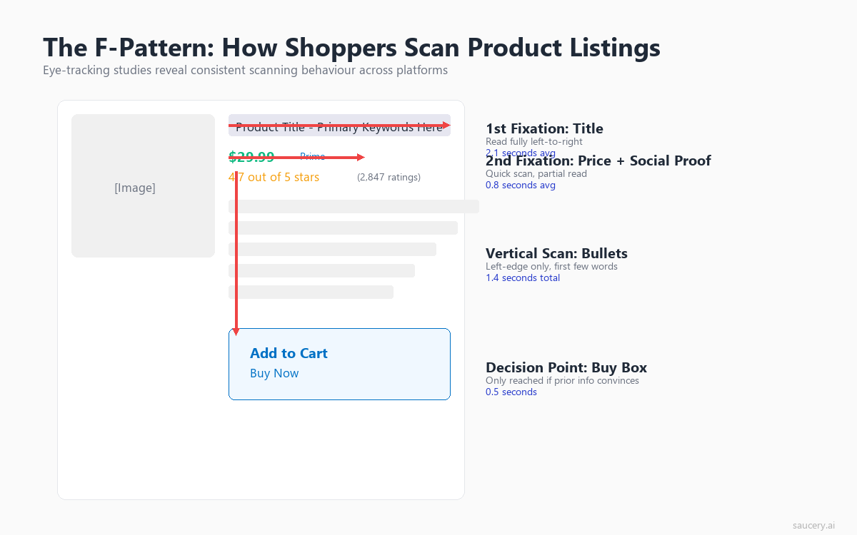
Jakob Nielsen’s landmark 2006 study at the Nielsen Norman Group established that users read web content in an F-shaped pattern. The pattern consists of two horizontal strokes across the top of the content, followed by a vertical scan down the left side. On product listings with bullet points, this pattern is pronounced:
- First horizontal stroke: Users read across the product title (or the first line of it on mobile). This is the top bar of the F.
- Second horizontal stroke: Users’ eyes drop down and read across the first bullet point or the opening line of the description. This is the lower bar of the F, typically shorter than the first.
- Vertical scan: Users scan down the left edge of the remaining bullets, reading only the first 2-3 words of each line. This is the stem of the F.
The practical implication is stark: the first words of each line get dramatically more attention than the last words. A bullet that reads “Contains 25g of protein per serving for sustained energy throughout your workout” gets most of its attention on “Contains 25g of protein.” The benefit statement at the end (“sustained energy throughout your workout”) is in the attention dead zone for most scanners.
This is why leading with benefits rather than features is structurally necessary, not just a copywriting preference. The F-pattern means the beginning of each line is prime real estate. If you start with “Made with” or “Features” or “Includes,” you’ve wasted your highest-attention position on generic filler words.
The Z-Pattern on Visual Listings
The Z-pattern applies to pages with a more balanced mix of images and text, where the layout doesn’t create a strong left-aligned text column. On platforms like Etsy, where listings feature large hero images with text below, the eye traces a Z-shape: top-left (product image) to top-right (title/price), down to bottom-left (description start), then across to bottom-right (add-to-cart area).
Research from Djamasbi et al. (2016) in the International Journal of Human-Computer Interaction found that the Z-pattern is more common on product pages with large images, while the F-pattern dominates on pages with structured text blocks (like Amazon’s bullet-point format).
For sellers on platforms like Etsy, this means the title area (top-right in the Z) and the opening description line (bottom-left) are your two critical copy zones. Everything between those points receives less deliberate attention.
The Layer-Cake Pattern
A third pattern that the Nielsen Norman Group has documented is the “layer-cake” scanning pattern, where users focus almost exclusively on headings and subheadings, skipping the body text entirely. This pattern appears on longer product descriptions and A+ Content sections on Amazon. Users skim the headings looking for relevant sections, then only read the body text under a heading that matches their specific question.
This is critical for sellers creating enhanced brand content or product descriptions longer than a few sentences. If your headings are generic (“Product Details,” “About This Item,” “Description”), scanners have no reason to stop and read the body text. If your headings contain specific benefits (“25g Protein, Zero Sugar,” “Machine Washable, Fits Standard Queen”), they function as standalone messages even for layer-cake scanners who never read below them.
Product Titles: The First Five Words Get 80% of Attention
Eye-tracking data consistently shows that the product title receives more fixation time than any other text element on a listing. But within the title itself, attention is not evenly distributed. The first five words of a product title capture approximately 80% of total title fixation time.
The Title Attention Curve
Research from the Baymard Institute’s product page studies shows that shoppers process product titles in a front-loaded manner. They read the first few words with full attention, then their processing becomes increasingly superficial as they move right (on desktop) or down (on mobile, where titles wrap).
The data breaks down roughly like this:
- Words 1-5: 80% fixation probability. Nearly every shopper processes these words.
- Words 6-10: 50% fixation probability. About half of shoppers read this far.
- Words 11-15: 25% fixation probability. Only a quarter of shoppers reach here.
- Words 16+: Below 15% fixation probability. Functionally invisible to most scanners.
This has massive implications for how you structure your product titles. The conventional approach of leading with brand name, followed by generic product category, wastes the highest-attention position on information that doesn’t differentiate. “Brand Name Premium Quality Natural” has burned five words before saying anything specific.
What Belongs in the First Five Words
Based on the attention data, the first five words should contain either:
- The primary differentiating attribute (what makes this product different from the ten others in search results)
- The exact product match for the search query (confirming relevance)
- A specific claim or number that creates a reason to click deeper
Compare these two titles for the same protein bar:
- Low attention: “GreenFit Premium Protein Bars, Natural Ingredients, 12-Pack Box, Chocolate Flavour, 25g Protein Per Bar”
- High attention: “25g Protein, Zero Sugar Bar – GreenFit Chocolate (12-Pack), All Natural Ingredients”
The second title leads with the two data points that differentiate (25g protein, zero sugar) in the exact words that most shoppers will actually process. The brand name and pack size sit further back, where buyers who are already interested will find them.
This front-loading principle applies across platforms. On Amazon, where titles can run 200+ characters, only the first 60-80 characters appear in search results. On eBay, the 80-character limit already forces compression. On Etsy, the first few words determine whether a shopper clicks through from search. In every case, the first five words carry the load.
Title Attention on Mobile vs Desktop
On mobile devices, the title attention curve is even steeper. Amazon’s mobile app shows approximately 55-60 characters of a title before truncation. Since mobile screens force titles to wrap, the second and third lines receive progressively less attention. A study published in the Journal of Business Research (2020) found that mobile shoppers spend 34% less time on product titles than desktop shoppers, making front-loading even more critical for mobile-dominant categories.
With mobile accounting for 60-70% of e-commerce traffic on most platforms, structuring titles for mobile attention patterns is no longer optional. It’s the primary design constraint.
Bullet Points: Attention Decay from First to Last
If title front-loading surprises you, the bullet point attention decay data will fundamentally change how you write your listing copy. Eye-tracking research shows a consistent and dramatic drop-off in attention from the first bullet point to the last.
The Bullet Point Attention Hierarchy
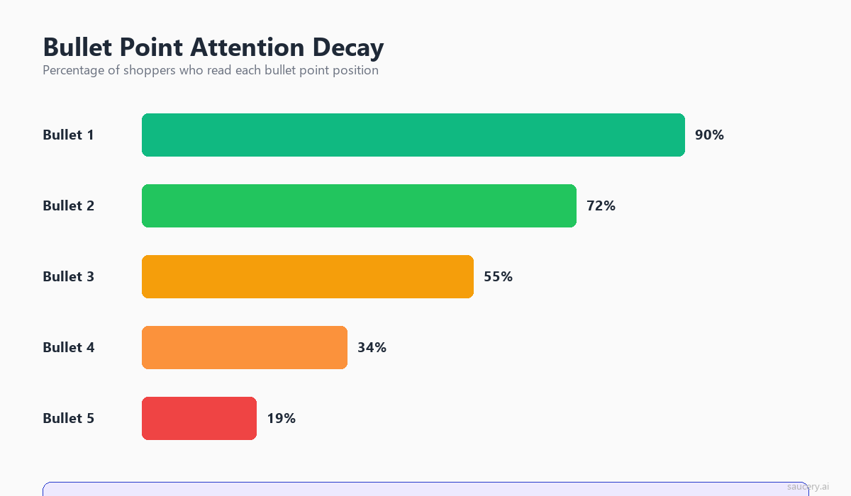
Across multiple studies of product listing behaviour, including research from the Baymard Institute and academic eye-tracking labs, a consistent pattern emerges:
- Bullet 1: Read by approximately 90% of shoppers who view the listing. Average fixation time: 2.1 seconds.
- Bullet 2: Read by approximately 75% of shoppers. Average fixation time: 1.6 seconds.
- Bullet 3: Read by approximately 55% of shoppers. Average fixation time: 1.2 seconds.
- Bullet 4: Read by approximately 35% of shoppers. Average fixation time: 0.9 seconds.
- Bullet 5: Read by approximately 20% of shoppers. Average fixation time: 0.6 seconds.
The first bullet receives roughly 2x the readership and 3.5x the attention time of the fifth bullet. Yet I consistently see listings where the most compelling benefit or differentiator is buried in bullet four or five, while bullet one contains generic category information like “Premium quality protein bar” or “Made with the finest ingredients.”
Why the Decay Happens
The attention decay across bullet points is driven by two psychological mechanisms:
Satisficing behaviour: Shoppers are not trying to process every piece of information. They’re looking for “good enough” signals that this product meets their needs. Once they’ve found 2-3 confirming signals (usually from bullets 1-3), they stop reading and move to the next decision element (price, reviews, or back to search results). This “satisficing” behaviour, documented extensively by Herbert Simon and applied to e-commerce by Bettman et al. in the Journal of Consumer Research, means that most shoppers never reach your later bullets regardless of how compelling they are.
Information overload: Each bullet point adds cognitive load. By bullet three, the shopper has already processed a significant amount of product information. Their attention capacity for additional text-based claims is diminished, and they’re more likely to skip ahead to visual or numerical elements (images, star ratings, price).
Implications for Bullet Point Strategy
The attention data demands a clear prioritisation strategy for your bullet points:
- Bullet 1: Your single strongest differentiator. The one thing that separates you from competitors. This is where your USP belongs.
- Bullet 2: Your primary benefit statement. What outcome does the buyer get?
- Bullet 3: Supporting proof or a secondary benefit. Specific data, certifications, or a second reason to buy.
- Bullet 4: Practical details that address common objections (size, compatibility, warranty).
- Bullet 5: Anything else. This position is functionally a bonus for the small minority who read everything.
Most sellers invert this structure. They put generic category claims in positions 1-2 (“Premium quality,” “Made with real ingredients”) and bury their actual differentiators in positions 4-5. The eye-tracking data shows this is essentially hiding your best arguments where most shoppers will never find them.
Same product. Better listing. More sales.
Find out which version of your product listing converts best – before you publish.
The Above-the-Fold Attention Cliff
The concept of “above the fold” originated in newspaper design, where stories above the physical fold of a broadsheet received dramatically more readership. In e-commerce, the fold is the bottom edge of the visible screen before scrolling. And the attention cliff at this boundary is severe.
How Much Attention Drops Below the Fold
Research from the Nielsen Norman Group shows that content above the fold receives 84% of total viewing time on average. Below the fold, attention drops by approximately 60% compared to above-fold content. On product listings specifically, the Baymard Institute found that only 38% of shoppers scroll past the initial viewport to read product descriptions or A+ Content sections.
This creates a practical constraint: anything below the fold is only seen by the minority of shoppers who are already leaning toward purchasing. Your above-the-fold content needs to do all the heavy lifting for the majority who won’t scroll.
What Sits Above the Fold on Each Platform
The “fold” varies significantly across platforms and devices:
Amazon Desktop: Primary image, title, star rating, price, bullet points 1-3 (bullets 4-5 are often below fold on standard monitors). This means your first three bullets are functionally your entire pitch for 62% of shoppers who don’t scroll.
Amazon Mobile: Primary image, title (often truncated), star rating, price, and sometimes the first bullet. The compression on mobile is extreme. Your title and price are often the only text elements processed before a scroll decision.
eBay Desktop: Gallery image, title, price, condition, and the first few lines of “Item specifics.” On eBay, the item specifics section functions like bullet points for the above-fold attention zone.
Etsy Desktop: Gallery images (larger proportion of screen), title, price, and the first 1-2 lines of description. Etsy’s image-forward layout means text competes with visuals for above-fold space.
Walmart Desktop: Similar to Amazon’s layout with image, title, price, and bullet points above fold. Walmart’s product pages show slightly fewer bullets above fold due to larger image sizing.
The “Scroll Trigger” and What Prompts It
Eye-tracking studies show that scrolling on product pages is not random. It’s triggered by specific cognitive states. Shoppers scroll when:
- They’ve found enough above-fold signals to be interested but need one more piece of information to decide
- They’re looking for specific technical details (dimensions, compatibility, ingredients)
- They want social proof beyond the star rating (individual reviews, user photos)
- The above-fold content has created a question the description might answer
The key insight: scrolling is a sign of interest, not a default behaviour. This means your below-fold content (descriptions, A+ Content, detailed specs) is primarily serving shoppers who are already predisposed to purchase. It needs to answer objections and provide confidence, not repeat the same benefits from above the fold.
Price and Reviews as Attention Anchors
Eye-tracking heatmaps consistently show two elements that act as “attention anchors” on product listings: the price and the star rating. These elements draw disproportionate fixation regardless of where the shopper is in their scanning pattern.
Price Fixation Patterns
Research published in the Journal of Retailing (2016) found that the price element receives an average of 3.2 fixations per product page view. This is significantly higher than any text element (titles average 2.1, bullet points average 1.1). The price acts as a “reference point” that shoppers return to multiple times as they process other information.
The fixation pattern on price follows a predictable sequence:
- Initial fixation (within first 2 seconds): Shoppers check price immediately after the title to establish whether the product is within their acceptable range.
- Return fixation (after reading 1-2 bullets): They glance back at price to weigh whether the benefit justifies the cost.
- Decision fixation (pre-purchase or pre-exit): A final price check before adding to cart or returning to search results.
This triple-fixation pattern means price isn’t just a number on your listing. It’s a context that colours how every other element is interpreted. A bullet point that reads “Organic, cold-pressed, Australian-grown” is processed differently when the price reads $14.99 versus $44.99. The attention data suggests that shoppers are constantly triangulating between benefits and price, even while reading your copy. Understanding this interplay is essential for your pricing strategy.
Star Rating as the Trust Gate
Star ratings and review counts function as an attention gate. Studies from the Baymard Institute show that shoppers fixate on the star rating early in their scan (typically second or third fixation point after the title and image) and use it to determine whether to invest further attention in the listing.
The data shows clear thresholds:
- 4.0+ stars with 50+ reviews: Shoppers proceed to read bullets and description. The trust gate is passed.
- 3.5-3.9 stars: Shoppers may still read further, but with a skeptical frame. They’re looking for reasons to disqualify rather than confirm.
- Below 3.5 stars or fewer than 10 reviews: Many shoppers exit without reading further. The attention invested in the rest of your listing drops dramatically.
This has a counterintuitive implication for copy strategy: if your reviews are weak, investing time in perfecting bullet copy has diminishing returns. The star rating gates whether your copy gets read at all. Conversely, strong reviews create a “permission to read” that makes every element of your copy more likely to receive attention.
The Interaction Between Price, Reviews, and Copy
The most interesting eye-tracking finding is how price and reviews interact with copy attention. When a product has strong reviews (4.5+ stars, 100+ reviews) and a mid-range price, shoppers spend more time reading bullet points. The trust signals give them permission to invest cognitive effort in the details.
When a product has few reviews but a compelling first bullet, eye-tracking shows increased fixation on the star rating area. It’s as if the copy creates interest, which then triggers a verification check on social proof. This suggests that copy quality matters most for newer products that haven’t yet accumulated strong review signals.
If you’re launching a new product with few reviews, your copy has to work harder. It’s doing the job that reviews normally do: building trust and confidence. This is where testing different copy approaches becomes critical. You need to know which version creates enough confidence to overcome the “thin reviews” barrier. I’ve written more about translating your USP into listing copy that builds that confidence.
Mobile vs Desktop: Two Different Reading Behaviours
Mobile and desktop shoppers are not just looking at smaller or larger versions of the same content. They exhibit fundamentally different scanning behaviours, attention patterns, and decision-making processes. The eye-tracking data shows these are effectively two different audiences requiring two different copy strategies.
Mobile Scanning: Faster, Shallower, More Decisive
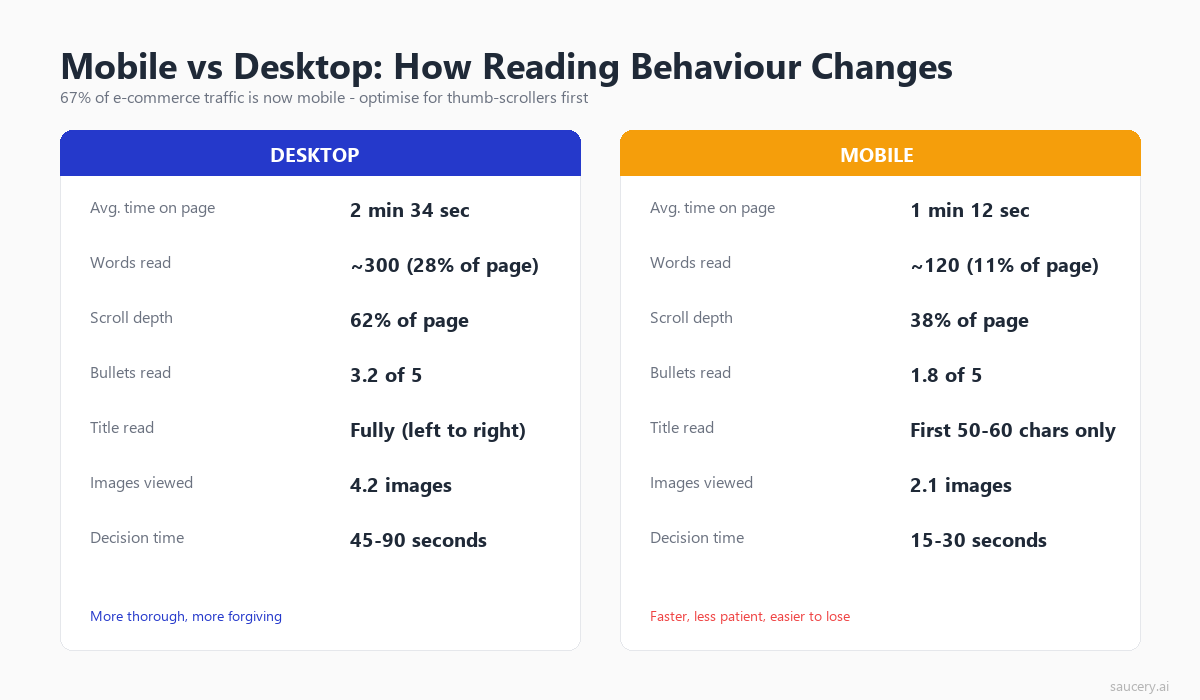
Research from Nielsen Norman Group’s mobile usability studies shows that mobile users:
- Spend 40% less total time on product pages compared to desktop users
- Process 60% fewer words per page view
- Make stay-or-leave decisions 3-4 seconds faster
- Are 2.5x more likely to use only the title and price for their decision
- Scroll less on product detail pages (only 28% scroll past the first screen)
The mobile scanning pattern is less “F-shaped” and more “I-shaped”: a single vertical scan down the centre of the screen, with brief horizontal fixations on high-contrast elements (price, bold text, numbers). Mobile shoppers are more influenced by the initial viewport and less likely to seek out additional information below the fold.
Desktop Scanning: More Exploratory, Higher Engagement
Desktop shoppers exhibit more complex scanning patterns:
- They read 2-3 more bullet points on average
- They’re 2x more likely to scroll to the product description section
- They spend more time on comparison behaviour (toggling between tabs or products)
- They fixate on image galleries more extensively (desktop image areas receive 24% of total page attention vs 18% on mobile)
- Their F-pattern is more pronounced and complete, meaning later bullets still receive meaningful attention
Writing for Both Audiences Simultaneously
Since you can’t create separate listings for mobile and desktop shoppers, the eye-tracking data suggests a dual-optimisation approach:
- Front-load everything: Structure for mobile first, where only the first screen matters. Desktop readers will also benefit from front-loading.
- Make bullet 1 standalone: It should convey your core value proposition without requiring bullets 2-5 for context. Mobile shoppers may only see this one.
- Use numbers and specifics early: Both mobile and desktop scanners fixate more on numerical data (“25g,” “500ml,” “3-pack”) than on adjective-heavy text (“premium quality,” “expertly crafted”).
- Keep bullet text short on mobile-dominant platforms: If 70% of your traffic is mobile (check your platform analytics), keep bullets under 150 characters to avoid truncation and cognitive overload on small screens.
The platform-specific traffic split matters enormously. Amazon reports that over 60% of shopping sessions happen on mobile. Etsy’s seller dashboard typically shows 65-70% mobile traffic. If your category skews even more mobile (supplements, beauty, impulse purchases), you need to weight your copy decisions even more heavily toward mobile scanning patterns.
The “Scanning to Deciding” Moment
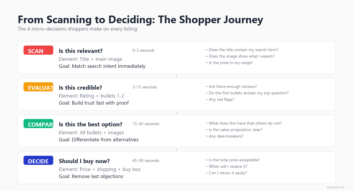
Eye-tracking research reveals a distinct shift in gaze behaviour when a shopper moves from scanning (evaluating whether to consider the product) to deciding (actively weighing whether to purchase). This transition is the most critical moment on your listing, and understanding what triggers it gives you a framework for structuring your copy.
The Behavioural Shift
During the scanning phase, eye movements are rapid and broad. Fixations are short (200-300ms) and saccades cover large areas of the page. The shopper is in “assessment mode,” determining whether this product is worth further consideration.
The deciding phase shows markedly different behaviour:
- Fixation durations increase by 40-60% (indicating deeper processing)
- Gaze patterns become more focused on specific elements rather than sweeping the page
- Regression rate increases (eyes return to previously-viewed elements for re-processing)
- The shopper begins toggling between elements (price to bullets, bullets to reviews, reviews back to price)
This toggling behaviour is the signature of active decision-making. The shopper is building a mental case for or against purchase, and they’re checking each element against their internal criteria.
What Triggers the Transition
Research from Wedel and Pieters (2020) in the Journal of Consumer Research identified several triggers that shift shoppers from scanning to deciding:
- A specific match to their search intent: When a bullet point directly addresses the specific problem they searched for, attention deepens.
- A surprising or differentiated claim: Information that doesn’t match the expected template for the category creates a “pattern interrupt” that triggers deeper processing.
- Social proof confirmation: A high star rating combined with a high review count often triggers the shift from scanning to deciding.
- Price-value alignment: When the perceived value from the first few elements matches or exceeds the price, shoppers shift to active purchase consideration.
The practical takeaway: your listing copy needs to create at least one of these triggers within the above-fold content. If the shopper completes their initial scan without hitting a trigger, they return to search results. The scan-to-decide transition is where conversions happen, and it’s driven by the specificity and differentiation of your copy, not its completeness.
Writing for the Decision Moment
The transition triggers suggest that your listing should create what I call “arrest points.” These are specific, differentiated claims positioned where eyes are most likely to land (bullet 1, opening of the description, A+ Content headline). An arrest point stops the scanner and turns them into a reader.
Effective arrest points share common characteristics:
- They contain specific numbers rather than vague claims (“25g protein per 200-calorie bar” vs “high protein, low calorie”)
- They reference a specific use case or outcome rather than generic benefits (“Survives machine washing 100+ cycles” vs “Durable and long-lasting”)
- They address a known category frustration (“No chalky aftertaste” for a protein bar, “Fits in standard cup holders” for a water bottle)
- They make a claim competitors don’t make, creating differentiation through specificity
Your product differentiation strategy should directly inform where you place arrest points. The thing that makes your product different from competitors is exactly the thing that should occupy bullet 1, where it has the highest probability of triggering the scan-to-decide transition.
Same product. Better listing. More sales.
Find out which version of your product listing converts best – before you publish.
Structuring Your Information Hierarchy
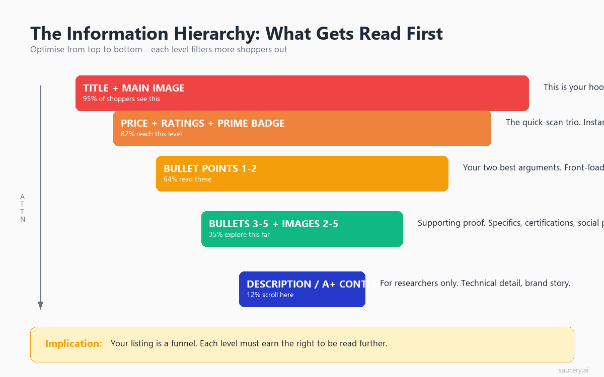
The eye-tracking data points to a clear information hierarchy for product listings. This hierarchy should govern not just what you write, but where you place each type of information relative to the attention patterns documented above.
The Attention-Based Information Pyramid
Based on the research, here’s how to prioritise information across your listing:
Level 1 (Highest Attention – Title + Bullet 1):
- Primary differentiator
- Core benefit statement
- Key specification that matters most to buyers
Level 2 (High Attention – Bullets 2-3):
- Secondary benefits
- Proof points and credentials
- Specific outcomes or results
Level 3 (Moderate Attention – Bullets 4-5):
- Practical details (dimensions, compatibility, materials)
- Objection handling (warranty, return policy, allergen info)
- Usage instructions or care details
Level 4 (Low Attention – Description/Below Fold):
- Brand story
- Detailed specifications table
- Extended use case scenarios
- Comparison information
This pyramid inverts the way most sellers write listings. The natural instinct is to open with context (brand name, product category, generic quality claims) and build toward the compelling details. But attention data shows the opposite approach works: lead with the most specific, differentiated information and save the context for those who read further.
Applying the Hierarchy Across Platforms
The hierarchy translates slightly differently across platforms based on their layout and character limits:
Amazon: Use the full 5-bullet structure as your hierarchy ladder. Each bullet should address one level. Don’t repeat information across bullets. Each one should deliver new, descending-priority information. Your Amazon bullet points are your primary conversion tool.
eBay: Item specifics function as your Level 1-2 hierarchy. The description (which requires scrolling) is Level 3-4. On eBay, the title carries even more weight because there are fewer structured text elements above the fold.
Etsy: Your first 160 characters of description appear in search results, making them equivalent to bullets 1-2. The full description serves as Level 2-4. On Etsy, tags and attributes also serve as Level 1 content because they determine search visibility.
Walmart: Similar to Amazon’s structure but with “Key Features” replacing bullets. Walmart’s algorithm also weights the short description heavily, making it functionally a Level 1 element.
The “Inverted Pyramid” Principle
Journalists have used the inverted pyramid for a century: lead with the conclusion, then provide supporting detail. Eye-tracking data on product listings validates this approach for e-commerce copy. The conclusion (your strongest benefit, your key differentiator, your best claim) should come first because it may be the only thing most shoppers read.
This conflicts with how many sellers naturally write. The instinct to “build up” to a conclusion, to establish context before making claims, is deeply ingrained. But on a product listing, the context only matters to people who’ve already been hooked by the conclusion. Give them the punchline first. Let the curious ones read the setup afterward.
Why Most Listing Copy Is Written Backwards
After analysing hundreds of product listings across categories, I’ve identified a consistent pattern: sellers write copy in the order that makes sense to them (the expert) rather than in the order that serves the reader (the novice buyer). This creates listings that are perfectly logical from the inside and completely ineffective from the outside.
The Seller’s Logic vs the Buyer’s Logic
Here’s how most sellers structure their bullets:
- Product category and brand name (establishing what it is)
- Materials or ingredients (establishing quality)
- Manufacturing process or certifications (establishing credibility)
- Specific features and specs (establishing detail)
- Benefit statement (the actual reason to buy)
This is the seller’s logic. It mirrors how they think about their product: starting with identity, building through credentials, arriving at benefits. It makes perfect sense if you’re writing a product brief or a technical document.
But the buyer’s logic is inverted:
- “What does this do for me?” (benefit/outcome)
- “Why should I believe that?” (proof/specifics)
- “Is it worth the price?” (value comparison)
- “Are there any dealbreakers?” (practical details)
- “Who makes it?” (brand/origin, if they care at all)
When you map these two logics against the eye-tracking attention data, the problem is obvious. The seller’s structure places the most buyer-relevant information (benefits) in the lowest-attention position (bullet 5), while placing the least buyer-relevant information (brand context) in the highest-attention position (bullet 1).
The “Feature-First” Trap
The most common version of backwards writing is the feature-first approach. Features are what the product IS or HAS. Benefits are what the product DOES for the buyer. The distinction matters because eye-tracking research from CXL Institute shows that benefit-led copy receives 28% more fixation time than feature-led copy in the same position.
Feature-first bullet examples:
- “Made with 100% organic cotton”
- “Features a triple-insulated stainless steel body”
- “Contains vitamin B12, iron, and zinc”
- “Includes adjustable shoulder straps”
Benefit-first equivalents:
- “Softer on sensitive skin (100% organic cotton, no synthetic blends)”
- “Keeps drinks cold for 24 hours (triple-insulated stainless steel)”
- “Sustained energy without the crash (B12, iron, and zinc in every serve)”
- “Fits any body shape comfortably (fully adjustable shoulder straps)”
Notice that the benefit-first versions still contain the features. They’re not removing technical information. They’re restructuring it so that the benefit occupies the high-attention front position and the feature (the proof) follows in a supporting role. Given the F-pattern scanning behaviour, the first few words of each bullet are the only words most scanners will process. Those words should answer “what does this do for me?” rather than “what is this made of?”
Why Sellers Keep Making This Mistake
Three factors drive the feature-first default:
The curse of knowledge: Sellers understand their product deeply. They know WHY each feature matters, so they assume the buyer will make the same inference. “Triple-insulated stainless steel” obviously means “keeps drinks cold” to the seller. But the scanner doesn’t pause to make that inference. They read the first few words, don’t find a relevant benefit, and move on.
Template mimicry: Sellers look at successful competitors and copy their structure. But successful products often succeed despite their copy, not because of it. A product with 10,000 reviews and an established brand can survive bad copy because the social proof carries the conversion burden. New listings don’t have that luxury.
SEO keyword stuffing: The belief that stuffing bullets with keywords improves ranking leads sellers to write for algorithms instead of humans. While keyword presence matters for discoverability, the algorithm also measures conversion rate. A listing that converts poorly because its copy is unreadable to humans will eventually lose rank regardless of keyword density.
How to Restructure a Listing for Attention
Now that we’ve established how shoppers actually read, here’s a practical framework for restructuring your listing copy to align with attention patterns. This isn’t theoretical. It’s based on the eye-tracking data mapped directly onto the listing elements you control.
Step 1: Identify Your Hierarchy
Before writing anything, rank your product’s selling points by buyer importance:
- What is the single strongest reason someone would choose your product over alternatives?
- What outcome does the buyer get from this product?
- What proof do you have that the product delivers on its promise?
- What practical concerns might prevent purchase (size, compatibility, allergens)?
- What background information might interest an already-committed buyer?
This ranking directly maps to your content hierarchy. Answer #1 goes in your title and bullet 1. Answer #5 goes in your product description below the fold.
Step 2: Front-Load Your Title
Take your answer to question #1 and put it in the first five words of your title. If your differentiator is a specific number (“25g protein”), lead with it. If it’s a specific claim (“Machine washable”), lead with it. If it’s a specific use case (“For sensitive skin”), lead with it.
Your brand name can follow after the differentiator. Unless you’re Nike or Apple, your brand name is not the reason someone clicks your listing. The differentiator is. Structure your product title to lead with what makes you different.
Step 3: Write Bullets in Buyer Logic Order
Map your five ranked selling points directly to your five bullet positions:
- Bullet 1 (90% readership): Primary differentiator + core benefit in one line
- Bullet 2 (75% readership): Outcome statement with proof point
- Bullet 3 (55% readership): Secondary benefit or credential that builds confidence
- Bullet 4 (35% readership): Practical detail that handles the most common objection
- Bullet 5 (20% readership): Additional detail for comprehensive readers
Within each bullet, apply the benefit-first structure: lead with what it means for the buyer, then provide the feature or proof in parentheses or after a separator.
Step 4: Optimise Each Bullet’s Opening Words
Given the F-pattern scanning behaviour, the first 3-4 words of each bullet carry disproportionate weight. Audit each bullet by covering everything after the fourth word. Does the remaining fragment still communicate something meaningful? If not, restructure.
Weak openings to avoid:
- “This product is designed to…” (5 words before the substance starts)
- “Made with premium quality…” (generic, no differentiation)
- “Our team has carefully…” (seller-focused, not buyer-focused)
- “Features include the following…” (filler that wastes prime position)
Strong openings that work:
- “Keeps drinks ice-cold 24hrs…” (specific benefit + number)
- “Zero sugar, 25g protein…” (key specs immediately)
- “Fits all standard cup holders…” (addresses specific concern)
- “Survives 100+ machine washes…” (proof through specificity)
Step 5: Create Below-Fold Content That Converts
Remember that below-fold content serves a different audience: the 38% who scroll are already interested. They don’t need to be re-sold on the product. They need:
- Answers to specific questions the bullets raised
- Detailed specifications for comparison shoppers
- Social proof beyond star ratings (testimonial-style content in A+ sections)
- Use case scenarios that help them imagine owning the product
- Cross-sell or bundle information
Don’t repeat your bullet points in the description. Scrollers have already read them. Use below-fold space to provide depth and address the specific objections that prevent conversion after initial interest.
Step 6: Test and Validate
The eye-tracking research gives you general principles, but every category and product has nuances. What works for a supplement listing might not work for a handmade candle listing. The hierarchy principles are universal, but the specific execution benefits from testing.
Run A/B tests with different bullet orders. Swap your current bullet 1 with your current bullet 4 and measure the impact. Test benefit-first versus feature-first versions of the same information. The attention data tells you WHERE shoppers look. Testing tells you WHICH content in those positions converts your specific audience.
Platform-Specific Attention Patterns
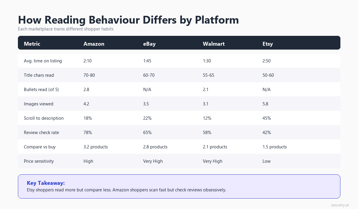
While the fundamental scanning behaviours are consistent across humans, each e-commerce platform creates slightly different attention patterns through its layout choices, element positioning, and content formats.
Amazon: The Bullet-Centric Layout
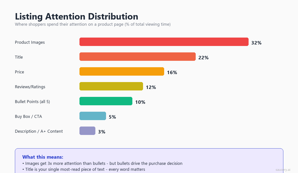
Amazon’s product detail page places heavy emphasis on the bullet point section. Eye-tracking on Amazon-style layouts shows:
- Title receives 15% of total page attention
- Primary image receives 22% of attention
- Bullet points (collectively) receive 18% of attention
- Price/rating area receives 12% of attention
- Everything below the fold receives 33% of attention (split across description, A+ Content, reviews, Q&A)
On Amazon, your bullets are your primary text-based sales tool. The description section, while indexed for search, receives comparatively little direct reading attention. A+ Content (enhanced brand content) performs better than text descriptions because it uses visual elements that interrupt scrolling patterns.
eBay: The Title-Heavy Platform
eBay’s layout is more title-dependent because the listing page structure varies more (auction vs buy-it-now, seller-customised descriptions). Eye-tracking shows:
- Title receives 20% of total page attention (highest among major platforms)
- Images receive 25% of attention
- Item specifics receive 14% of attention
- Price/shipping area receives 15% of attention
- Description section receives 26% of attention
On eBay, the title has to work harder because there’s no standardised bullet-point section above the fold. Your 80-character title and item specifics are the primary above-fold text elements. The description (which requires scrolling) gets more attention on eBay than Amazon descriptions do, possibly because eBay buyers are more accustomed to checking the description for seller-specific details (condition notes, shipping policies, bundled items).
Etsy: The Visual-First Platform
Etsy’s large image gallery and visual-focused design shifts attention patterns:
- Images receive 32% of total page attention (highest among platforms)
- Title receives 14% of attention
- Price/shipping area receives 13% of attention
- Description receives 20% of attention
- Reviews receive 21% of attention
On Etsy, copy is less dominant in the attention mix. The description does more work than on Amazon because there’s no bullet-point structure. Buyers expect longer, more narrative descriptions on Etsy, and they’re more willing to read them. This is the one platform where a slightly longer, more storytelling-oriented copy approach aligns with attention patterns.
Walmart: The Comparison-Focused Layout
Walmart’s product pages emphasise comparison features and price-matching:
- Price receives 16% of attention (highest among platforms, reflecting Walmart’s price-sensitive audience)
- Title receives 14% of attention
- Key Features (bullets) receive 17% of attention
- Images receive 20% of attention
- Everything else receives 33% of attention
On Walmart, price dominates the attention mix more than on any other platform. This means your copy needs to work harder to justify price. If you’re not the cheapest option, your key features must clearly articulate why the premium is worth it. The value proposition needs to be immediately apparent in the high-attention zones.
Cross-Platform Consistency
If you sell on multiple platforms, the core hierarchy principles remain the same. Front-load your differentiator, lead with benefits, use specific numbers. But the execution weight shifts:
- On Amazon, invest most in bullet 1 and your title’s first five words
- On eBay, invest most in your title and item specifics
- On Etsy, invest most in your first description paragraph and image quality
- On Walmart, invest most in key features and price justification
The underlying copy can be adapted rather than rewritten from scratch if you’ve structured it with the information hierarchy in mind. Your USP-to-listing translation process should produce a hierarchy that can be deployed across platforms with formatting adjustments rather than fundamental content changes.
Same product. Better listing. More sales.
Find out which version of your product listing converts best – before you publish.
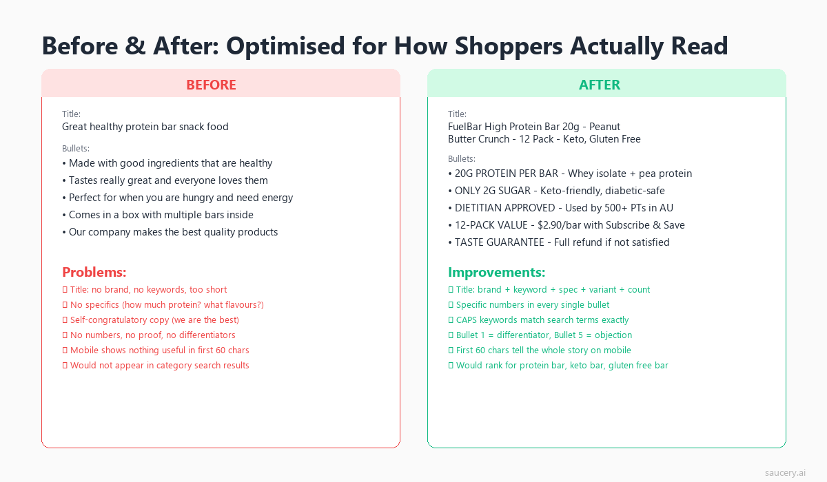
Practical Before-and-After: Restructuring a Real Listing
Let’s apply everything from this article to a concrete example. Here’s a typical supplement listing (simplified) written in the conventional feature-first structure, followed by the attention-optimised restructure.
Before: Feature-First Structure (How Most Sellers Write)
Title: NutriMax Premium Protein Powder, High Quality Whey Protein Isolate, Chocolate Flavour, 2lb Container, Made in USA
Bullets:
- PREMIUM QUALITY: Made with 100% grass-fed whey protein isolate sourced from hormone-free dairy farms in New Zealand
- CLEAN INGREDIENTS: No artificial sweeteners, no fillers, no soy lecithin, only natural cocoa and stevia leaf extract for flavour
- EASY TO MIX: Ultra-micronised powder dissolves instantly in water, milk, or smoothies without clumping or grittiness
- HIGH PROTEIN: Each serving delivers 27g of protein with only 120 calories, 1g sugar, and 2g fat for lean muscle support
- SATISFACTION GUARANTEED: 30-day money-back guarantee if you’re not completely satisfied with our product
Problems With This Structure (Eye-Tracking Perspective)
- Title: “NutriMax Premium Protein Powder” wastes the first five words on brand name and category. A shopper searching for protein powder already knows what they’re looking for.
- Bullet 1 (90% readership): Talks about the source of the whey. Important, but not the primary buying reason. The scanner sees “PREMIUM QUALITY: Made with” and may stop there.
- Bullet 4 (35% readership): Contains the actual nutritional specs (27g protein, 120 calories, 1g sugar) that most buyers are comparing across products. Only 35% of shoppers will ever see this.
- Bullet 5 (20% readership): A generic guarantee that doesn’t differentiate.
After: Attention-Optimised Structure
Title: 27g Protein, 1g Sugar Whey Isolate – NutriMax Chocolate (2lb, 30 Servings) Grass-Fed, No Artificial Sweeteners
Bullets:
- 27g PROTEIN, ONLY 120 CALORIES per serving. The macro ratio competitive athletes and body recomposition plans require. Just 1g sugar and 2g fat per scoop.
- NO CHALKY AFTERTASTE: Ultra-micronised grass-fed whey isolate dissolves completely in 5 seconds. No clumping, no grittiness, no blender required.
- ZERO ARTIFICIAL SWEETENERS: Flavoured only with natural cocoa and stevia leaf. No sucralose, no acesulfame-K, no soy lecithin. Every ingredient you can pronounce.
- GRASS-FED NEW ZEALAND WHEY: Sourced from hormone-free dairy farms. Cold-processed to preserve protein bioavailability. Third-party tested for purity.
- 30-DAY GUARANTEE + 30 SERVINGS per container. If your shaker isn’t empty in a week, we’ll refund you. That’s how confident we are in the taste.
What Changed and Why
- Title: First five words are now “27g Protein, 1g Sugar” – the exact specs shoppers are comparing. Brand name moved to mid-title where interested shoppers will find it.
- Bullet 1: Now contains the nutritional bottom line – the #1 thing protein powder buyers compare. Moved from position 4 to position 1, increasing its readership from 35% to 90%.
- Bullet 2: Addresses the #1 category complaint (bad taste/texture) immediately. This is an arrest point – a differentiated claim that triggers deeper reading.
- Bullet 3: The clean-label angle, now with specific negative claims (no sucralose, no acesulfame-K) that differentiate from competitors.
- Bullet 4: Source and quality credentials. Still present but moved to a lower-attention position where committed readers will find it.
- Bullet 5: The guarantee, now made specific and personality-driven rather than generic.
The same information exists in both versions. No content was added or removed. The only change is the order and the front-loading of each bullet’s opening words. Yet the attention-optimised version puts the decision-relevant information where 90% of shoppers will actually see it, rather than burying it where only 35% will read.
The Data-Driven Approach to Listing Copy
Eye-tracking research tells you where shoppers look. It doesn’t tell you what to say. The “where” is consistent across categories (first five words, bullet 1, above the fold). The “what” depends on your specific product, category, and competitive set.
Combining Attention Data With Competitive Analysis
The most effective approach combines attention principles with competitive intelligence:
- Map the attention zones: Identify where eyes land on your platform’s listing format (title first words, bullet 1-2, price area).
- Audit competitor listings: What do the top 5 competitors put in THEIR high-attention positions? This tells you what the category norm is.
- Find your differentiation gap: Identify claims you can make that competitors DON’T make in their high-attention positions. This is your opportunity for an arrest point.
- Place your differentiator in position 1: Put the thing that separates you from the competitive set in the highest-attention position available.
- Test the placement: Validate that your chosen differentiator actually matters to buyers by testing different versions.
This process is where product differentiation meets copy structure. Having a differentiator is necessary but not sufficient. You also need to place it where shoppers will actually see it.
What the Eye-Tracking Data Cannot Tell You
It’s worth being transparent about the limitations of attention research when applied to listing optimisation:
- Looking doesn’t mean processing: A fixation indicates the eye landed on an element, but doesn’t guarantee the brain processed and stored the information.
- Lab conditions vs real shopping: Many eye-tracking studies are conducted in controlled lab environments. Real shoppers are multitasking, distracted, and operating under different time pressures.
- Category variation: A $9 impulse purchase has different attention patterns than a $900 considered purchase. The general principles hold, but the degree of engagement varies.
- Individual variation: Some shoppers are detail-oriented researchers who read everything. They’re the minority (roughly 15-20% of the population), but they exist. The attention averages describe the majority, not every individual.
These limitations don’t invalidate the approach. They contextualise it. The eye-tracking data gives you probabilistic guidance: structure X receives more attention from more people more often. It doesn’t guarantee that every single shopper will follow the predicted pattern.
The Case for Testing
This is precisely why testing different listing versions matters. The eye-tracking research tells you the principles (front-load, benefit-first, hierarchy matching). But the specific execution that maximises conversion for YOUR product, in YOUR category, with YOUR price point, requires testing.
Should your title lead with “25g protein” or “zero sugar”? Should bullet 1 focus on taste or macros? Should you emphasise the sourcing story or the price-per-serving? The attention framework tells you that whichever answer you choose should go in position 1. Testing tells you which answer is correct.
I’ve seen sellers spend weeks crafting the “perfect” listing without ever testing alternatives. The data consistently shows that the seller’s intuition about what matters to buyers is wrong roughly 40% of the time. You don’t know which version wins until you test it. What you can know, from the eye-tracking research, is exactly where to place the winning version once you’ve identified it.
Key Takeaways: Eye-Tracking Rules for Listing Copy
Here are the actionable rules derived from the eye-tracking research, consolidated for implementation:
- First five words of your title carry 80% of title attention. Lead with your differentiator or primary spec. Brand name goes after.
- Bullet 1 gets 2x the readership of bullet 5. Put your strongest selling point first, not last.
- The F-pattern means only the first words of each line get full attention. Start every bullet with the benefit, not the feature.
- 84% of viewing time is above the fold. If it matters, it must be visible without scrolling.
- Mobile shoppers spend 40% less time and process 60% fewer words. Front-load everything as if mobile is your only audience.
- Price gets 3.2 fixations per page view. It’s not just seen. It’s actively referenced against every other element.
- Star ratings gate whether your copy gets read. Below 3.5 stars, copy improvements have diminishing returns.
- Shoppers satisfice, not optimise. They stop reading after finding 2-3 confirming signals. Make those signals appear in bullets 1-3.
- The scan-to-decide transition requires an arrest point. One specific, differentiated claim in the high-attention zone triggers deeper engagement.
- Benefits receive 28% more fixation than features in the same position. Lead with outcomes, support with specs.
These rules apply regardless of platform, category, or price point. They’re derived from how human visual attention works, not from any single platform’s algorithm. Apply them to your e-commerce listing optimisation strategy across every marketplace you sell on.
Frequently Asked Questions
What percentage of shoppers actually read all five bullet points on a product listing?
Eye-tracking research shows that approximately 20% of shoppers read all five bullet points. The readership drops steeply from bullet 1 (90%) to bullet 5 (20%). Most shoppers satisfice after 2-3 bullets, meaning they find enough information to make a stay-or-leave decision without reading the full set. This is why bullet order matters more than bullet quantity.
Does the F-pattern scanning behaviour apply on mobile devices?
On mobile, the F-pattern is less pronounced and shifts toward an I-pattern (a single vertical scan down the centre of the screen). Mobile shoppers spend 40% less time on product pages and process 60% fewer words than desktop shoppers. The front-loading principle is even more critical on mobile because the window of attention is shorter and narrower.
How important are the first five words of a product title for conversions?
The first five words of a product title receive approximately 80% of total title fixation time across eye-tracking studies. On platforms like Amazon, where titles can exceed 200 characters but only 60-80 show in search results, the first five words determine whether a shopper clicks through. Leading with your primary differentiator or key spec in these words significantly impacts both click-through rate and on-page engagement.
Should I write different listing copy for mobile and desktop shoppers?
Since most platforms don’t allow separate mobile and desktop listings, the best approach is to optimise for mobile first. This means front-loading all critical information, keeping bullet text concise (under 150 characters), and ensuring bullet 1 works as a standalone value proposition. Desktop shoppers benefit from this approach too, as front-loaded content still gets read first regardless of screen size.
What triggers a shopper to stop scanning and start seriously considering a product?
Research identifies four primary triggers for the scan-to-decide transition: a specific match to search intent, a surprising or differentiated claim, strong social proof (high rating + high review count), and price-value alignment. The most controllable trigger through copy is the “arrest point,” which is a specific, differentiated claim placed in the high-attention zone (bullet 1 or title) that creates a pattern interrupt from the expected category template.
How does the star rating affect whether shoppers read my listing copy?
Star ratings function as an attention gate. Products with 4.0+ stars and 50+ reviews see normal copy engagement. Below 3.5 stars, many shoppers exit without reading further. Eye-tracking shows that the star rating is typically the second or third fixation point (after title and image), making it an early filter in the decision process. If your reviews are poor, investing in copy improvement has diminishing returns until the rating improves.
Is there an ideal length for bullet points based on attention research?
Eye-tracking data suggests that bullets between 80-150 characters receive the best combination of readership and comprehension. Bullets under 80 characters may lack enough substance to create an arrest point. Bullets over 200 characters suffer from the F-pattern effect, where the second half of the line receives minimal attention. For mobile-dominant categories (which is most categories today), staying under 150 characters ensures the full bullet is visible without wrapping into low-attention zones.
Same product. Better listing. More sales.
Find out which version of your product listing converts best – before you publish.
About the Author
Andrew Mac is the founder of Saucery.ai, where he builds AI-powered tools that help e-commerce sellers write product listings that convert. He’s run listing experiments across Amazon, eBay, Etsy, and Walmart for brands ranging from private label supplements to handmade homewares. Connect with Andrew on LinkedIn.
Subscribe for F&B Consumer Insights
Data-driven insights on food & beverage consumer preferences, straight to your inbox.